You know UX design is important
You know UX design is important. You know a website needs to be engaging and
maximized for customer satisfaction to generate sales and leads. But what
exactly makes a great UX design? How can yours stand out among the best of the
best? Our UX designers weighed in on their favorites to give you the 10 best
user experience websites!
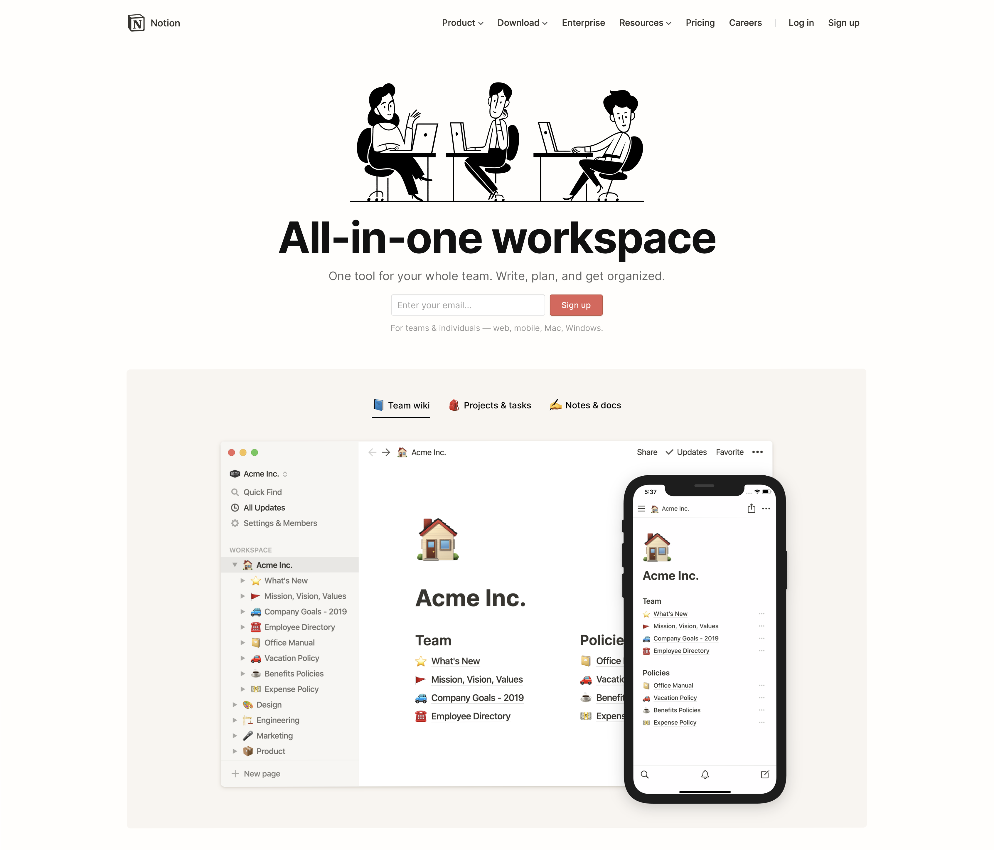
Notion
Notion’s homepage demonstrates the power of its tool upon arrival,
immediately focusing the customer’s attention on how the
tool solves their problems. You’ll feel like you need it within the first
few seconds of hitting their site! In fact, customers and our designers have
found themselves using Notion both to organize work life and home life.
Where productivity tools often overcomplicate the user experience, Notion
has simplified it, making the web application fun to use and welcoming
experimentation, allowing the customer to imagine their life and needs at
work and at home through the lens of this powerful tool. Detailed visuals,
along with a snapshot of functionalities, make it easy for customers to see
what Notion’s software can do to serve them. The “Sign Up” call to action is
always available throughout the user experience, making it effortless for
visitors to become users. This UX design makes it fun for users to explore
Notion’s home page.
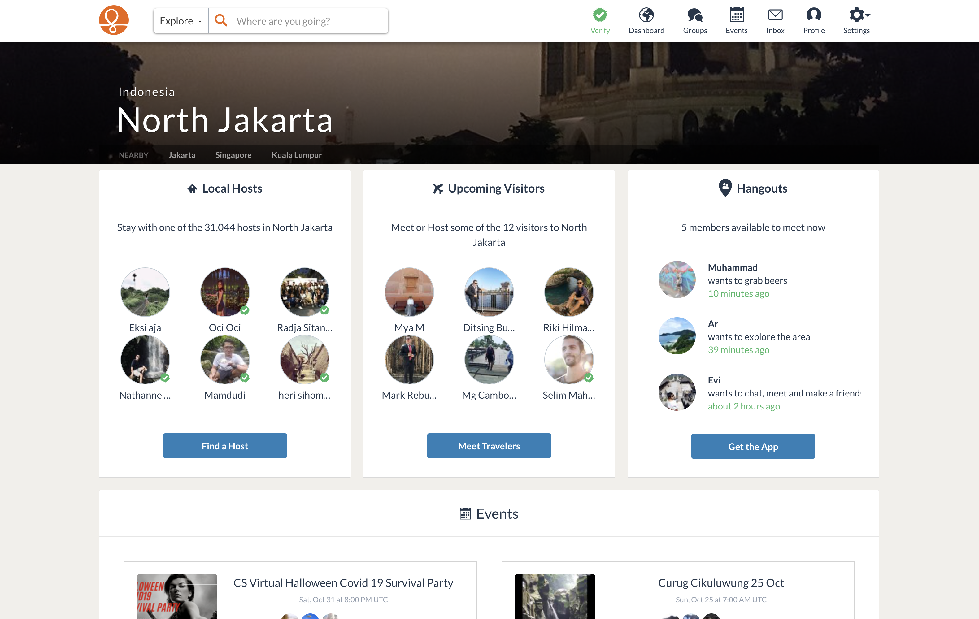
Couchsurfing
The simplicity of
Couchsurfing’s home page is what
makes it a phenomenal user experience and design. Customers can quickly find
locals with accommodations to stay with during their trip. A tab at the top
named “How it Works” takes you to a page that explains exactly how to use
Couchsurfing. It doesn’t get any easier or more efficient than this design!
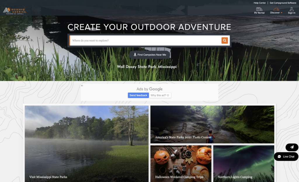
Reserve America
Reserve America’s website design
immediately builds an emotional connection! The first thing you
want to do when you go to Reserve America’s website is to take an adventure and
go on a vacation. A handy search bar, front and center, allows visitors to type
in a destination. Once you click Search, you are redirected to a map with pins
of the different places you can stay in that area. There are places to stay
listed on the left-hand side with clickable links. Finding resources for
camping, hiking, hunting, and fishing is a breeze. Beautiful photographs
combined with an intuitive design make visiting this website an exceptional
experience.
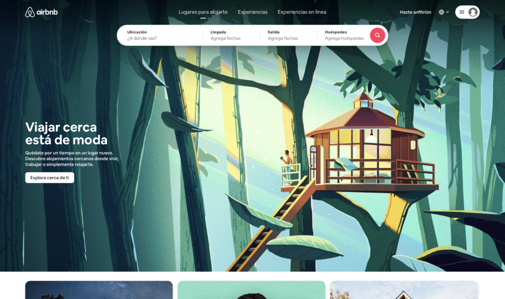
Airbnb
Much like Couchsurfing’s website,
Airbnb’s home page is
straightforward and clean. A search bar at the top allows
visitors to quickly set the parameters of their trip. The calming graphic design
eases the anxiety of the travel process. As you scroll down the page, visitors
are met with useful online resources without distracting from the focus of
finding a place to stay for an upcoming trip or vacation.
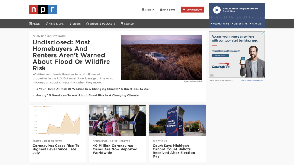
NPR
NPR’s website is jam-packed full of
information in a simple layout. The hottest topics line the home page, while a
menu bar at the top makes it easy to narrow down for your
specific search. A straightforward site that packs a big punch, that’s a key UX
best practice!
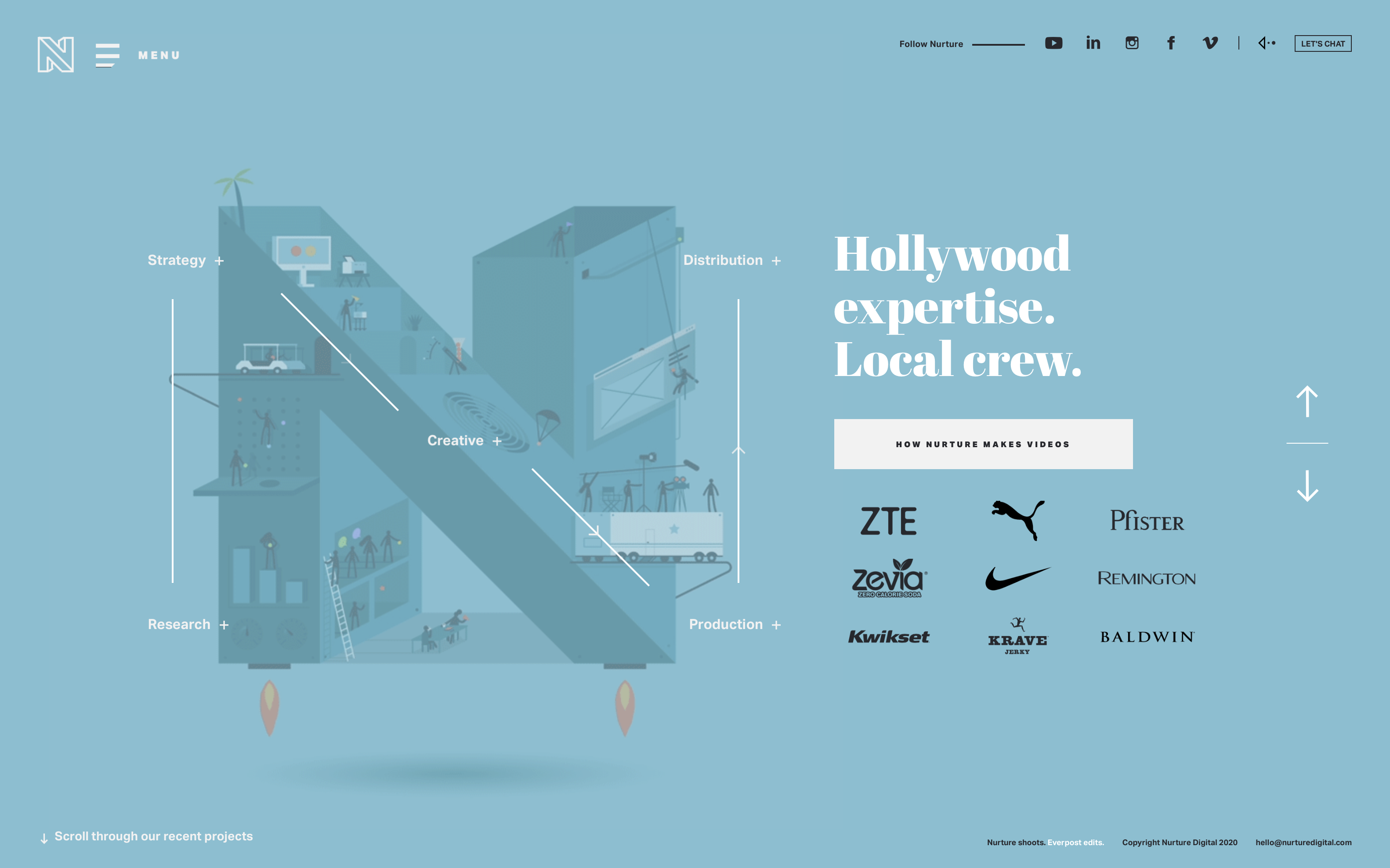
Nurture Digital
This is a captivating website with
amazing yet minimalist graphics. One of our
design inspirations, through a creative visual Nurture Digital
immediately tells visitors what it is they can do for their company. On the
right-hand side of the website is a list of well-known clients and their case
studies. Visitors can trust Nurture Digital’s proven track record of
high-quality!
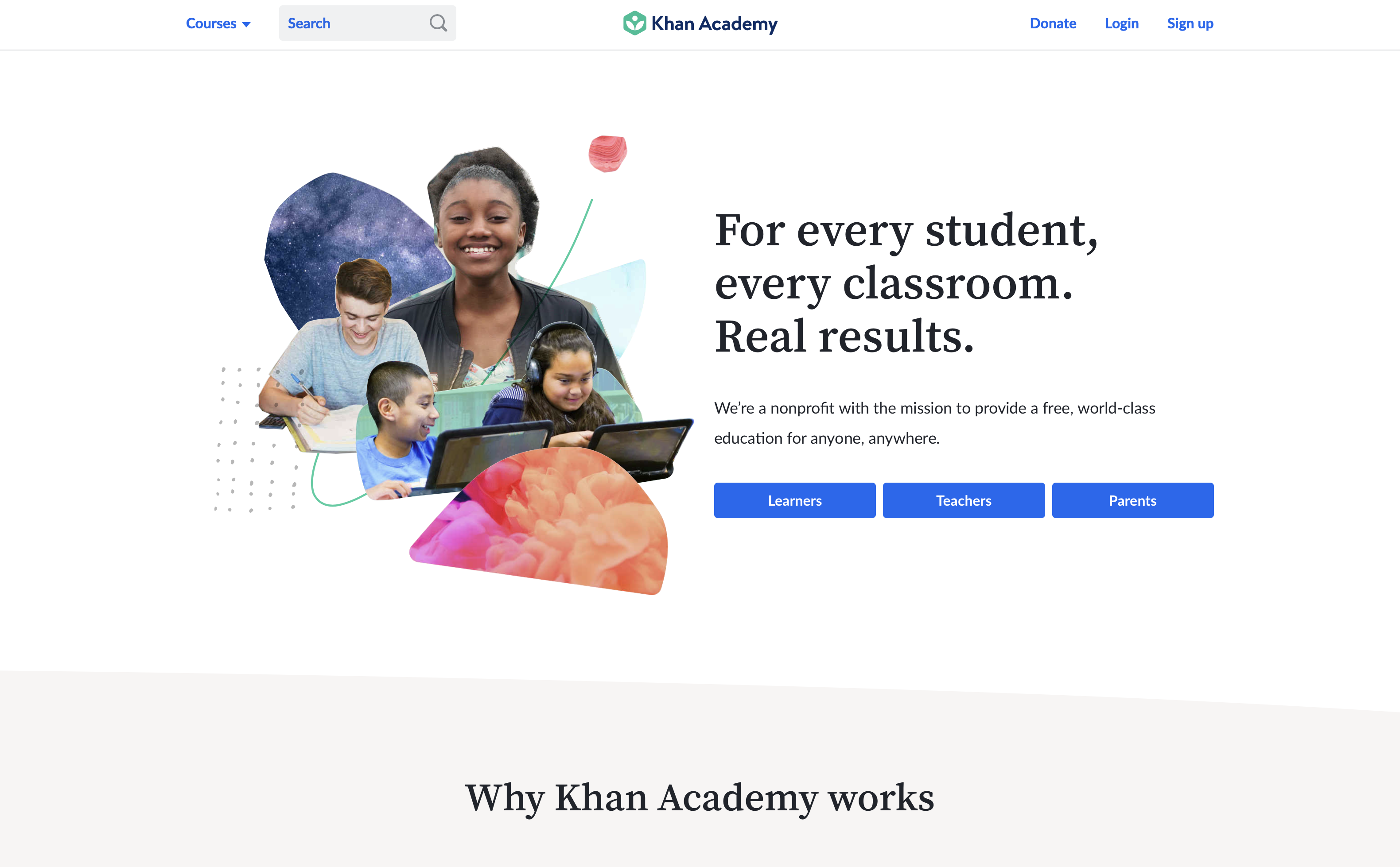
Khan Academy
Khan Academy has a lot to say, and they do an award-winning job of saying it on
their homepage. The flow is amazing. A menu bar at the top
allows users to find exactly what they want. The very first block tells users
the purpose of the business, and the next block gives users a snapshot of why
Khan Academy is effective. The final three blocks give teachers, districts, and
students a clear action button to get started. It is an
easy-to-navigate website that
effortlessly engages the customer.
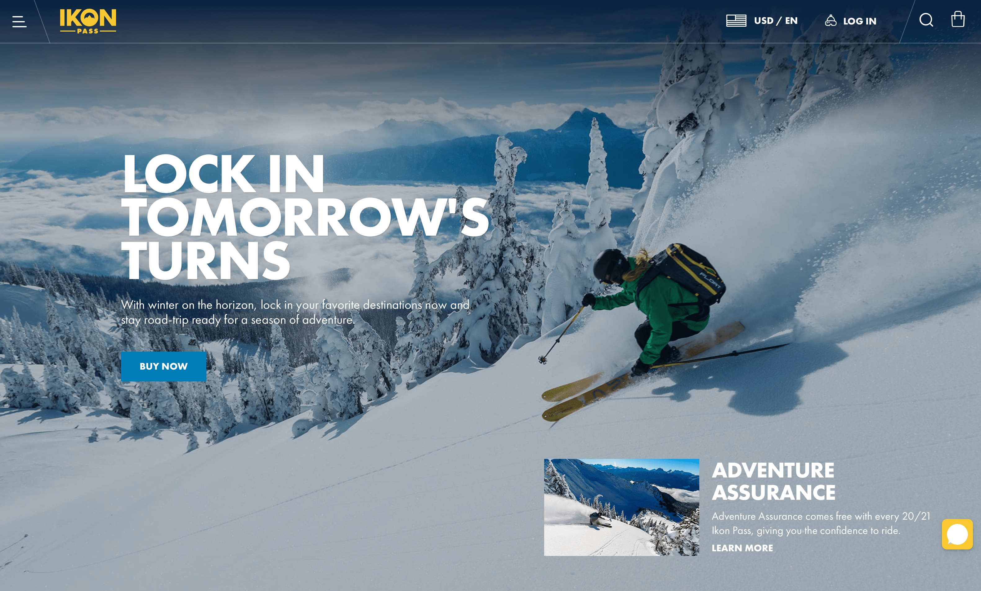
Ikon Pass
Ikon Pass has an amazing and engaging UI/UX design. Their
content provides a lot of resources for the Ski and Snowboard enthusiast, and
their design does a great job amping you up for their season pass, even during a
global pandemic! Visitors are met with a background of beautiful mountains
covered in snow with a person skiing. They’ve even made scrolling the homepage
super entertaining, with fun animations that make you want to keep exploring.
Their mobile app offers additional features, like tracking your runs, discounts
at participating retailers and restaurants, and an interactive ski resort map.
With a design that provides simplicity to get started, tips to make the most of
your adventure, plus a chat button to capture any questions immediately,
Ikon Pass keeps you engaged with their site
by knocking it out of the park with their UX design.
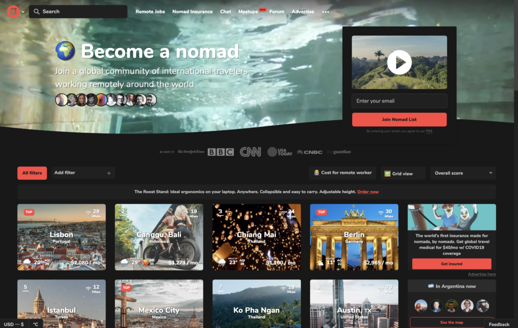
Nomad List
This is a great UX design because it allows users to find all of the information
they need in one place. Its grid layout makes it easy to navigate, and the
images of each location give the user the feeling that they can pop in and out
of the places they’d like to be! The best part of
this website is that visitors can customize
their results to make sure that they only get what they need!
Your UX Design Weapon
A captivating website is vital to increasing sales, transforming leads, and
growing your company. 729 Solutions is your secret weapon! Our team is
dedicated to making sure that your website is a memorable and irreplaceable
experience…in all the right ways!
Contact us today to get started!